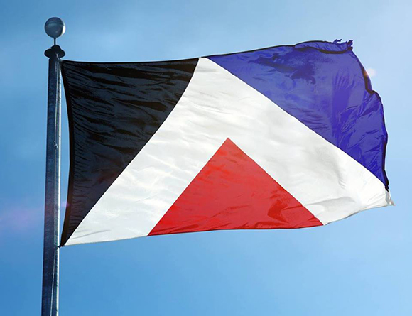
So here we are. Myself, along with perhaps a good portion of the country, wait with baited breath to hear the results of a meeting between Prime Minister John Key and the Labour leader Andrew Little today, to see if The Red Peak design becomes a wildcard fifth entry, joining those already shortlisted as potential designs for a new New Zealand flag. Or possibly even nudging out one of Kyle Lockwood's colourways to become a genuine fourth contender. Here's hoping.
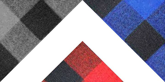
The emergence of the Red Peak design has come as a saving grace in this whole process – an example of a flag which meets the criteria of the Flag Consideration panel in its simplicity, elegance and most crucially, RESONANCE. Somehow, it escaped the attention of the panel charged with identifying such characteristics initially, but it has already passed a true(r) test of its merits – the ability to capture the hearts and minds of New Zealanders. A visit to the pages of the Red Peak facebook page, or a trawl through any other Social Media waters, will reveal a huge outpouring of tangible support for this motif, in ways which could not have been foreseen. New Zealanders are embracing the design as their own: creating their own Red Peak representations in anything from Swandri swatches to Woolly hats. It has even become the livery of a Superhero. Rowan Simpson has mobilised the groundswell of public support, first by writing a blog which articulated his own thoughts about the design, and was then involved (with Catherine Wilson) in organising a petition which rapidly gathered 50,000 signatures. Quite simply, this has forced the powers that be to sit up and take notice. And arrange to have a cup of tea to talk about it.
I'll be completely honest. At first, I was slightly underwhelmed by the design. It was not familiar to me, as a representation of New Zealand, or what New Zealand stood for. I was still smarting from the results of the Flag Consideration Panels' process, (and my own designs' exclusion from the shortlist)* and bemoaning the paucity of the final selection of 3, sorry, 4 designs which smacked of conservatism, amateurism, and lets face it, crony-ism. Quite possibly, these designs were ones pre-ordained to have considerable popular support, together with the support of our Prime Minister John Key and latterly none other than our esteemed All Blacks Captain (Sir) Richie McCaw. If we were in Italy, it would be the equivalent of the Pope's blessing. Along with Berlusconi. The process itself now appears to be not-so-much designed to unearth an inspiring design solution, but to come up with alternatives to 'get the new flag over the line,' in a winner-takes-all battle with the encumbent. Of course flags which represent familiar icons would be more likely to find favour with the general population, and hence more likely to lead to the desired result – a change of flag in the final referendum. A touch cynical? Perhaps. But John Key can be credited as being particularly savvy about the workings of the democratic process. Appealing to a larger demographic makes complete sense in this context and contest.
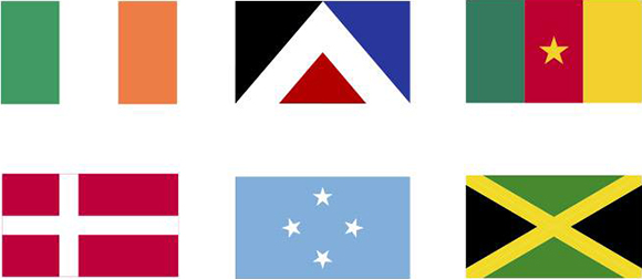
But enough about politics, and back to the design. Over time, the Red Peak has grown on me. The elegance and simplicity of the design is captivating. It's certainly easy to reproduce. The old 'so easy a child could draw it' test is passed hands down. Its simple, abstract form belies a complexity. It invites enquiry, engagement and intrigue, like all the very best designs do. It manages to combine three colours (ok, four if you include white) which are each in their way deeply significant to Maori and European symbology, and synonymous with flag design. The design sits comfortably within the international flag design lexicon, while managing to appear unique and distinctive sitting alongside other national flags.
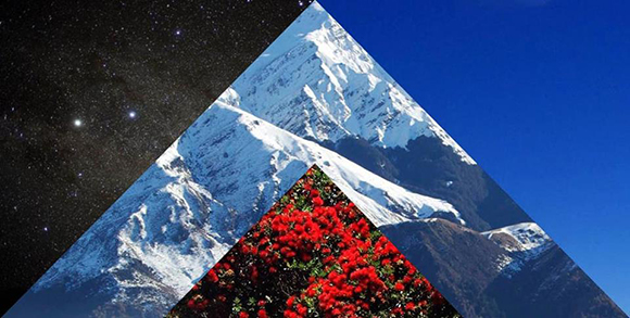
Strangely, the Red Peak is not overtly familiar as a New Zealand symbol, but surely has the potential to become one. It literally points upwards to the future, while connecting with the past. In doing so, it pays tribute to the spiritual beliefs of the indigenous people of Aotearoa, the Maori, and an understanding which is accessible and relevant to all New Zealanders.
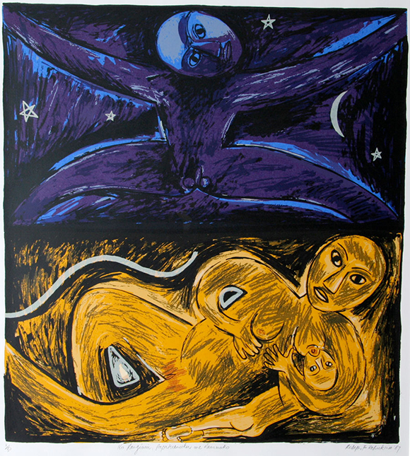
image: Robyn Kahukiwa
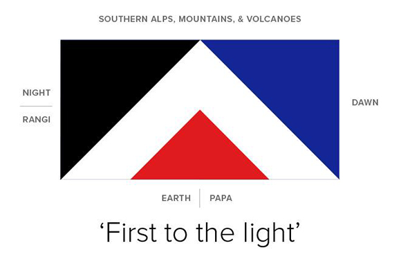
The Red Peak is one of the few flag designs to emerge which references the creation story of Papatuanuku (Mother Earth) and Ranginui (Father Sky), or at least has prompted some discussion around it. This is a foundation of not just Maori but New Zealand culture, which demands inclusion, or at least consideration. It is certainly a formative story for me, growing up in the Waikato. In the Red and Black elements we have representations of these elements, and in the white area in between: 'Te Ao Marama,' the realm of Creation and Being, in which we dwell. Granted, this is a reading of the Red Peak design I have made personally, which is not necessarily intended in the design. But herein lies the value of the design – that it allows multiple readings, and meanings, allowing for a connection and a certain sense of ownership for New Zealanders, for a variety of different reasons.
Could this be a reason why the Red Peak design is imbued with a certain resonance, and created the response it has? That it captures messages, or meanings, that have a deeper emotional and spiritual connection to us as New Zealanders, even if perhaps we cannot quite put a finger on them? Perhaps it takes us into a deeper and richer realm than those opened up by icons or symbols such as the silver fern, or the koru. The conversation around the design itself changes. I have heard very little discussion about the merits of the other shortlisted designs, in terms of what they signify. Sure, they are representative of New Zealand. You cannot argue with the silver fern as a powerful motif, synonymous with New Zealand, and integrally linked with perceptions of ourselves as a country and as a people. Primarily, I would say, as a signifier of achievement on the sporting field, not least with the heralded All Blacks – 'the most dominant team in world sport.' But the refrain which accompanies this symbol is an old one, of 'a small country, punching above its weight' which perversely speaks of the colonial roots which you would expect a new flag to distance itself from. In my view, this is a self-view, and a world-view, which no longer serves New Zealand. We are entering a world where it's not about proving yourself on the world stage, but simply being yourself. And playing a part. The koru is a powerful symbol too. If anything, it signifies new growth, an unfolding. It has and will continue to serve as an evocative symbol or logo for countless New Zealand companies or products, but doesn't quite have the weight or presence appropriate for a national ensign.
And what about the design? For me, the execution of the shortlisted flags leave something to be desired. I am not in favour of either (sorry) any of three silver fern designs, for a number of reasons which have probably been voiced elsewhere. I know Dave Clark has offered to redraw the silver fern (what, to make it look more like his – sorry – the All Black Fern?) – but this sort of misses the point. Quite simply, I suspect they would not be being judged so harshly on their appearance, if they had something of greater import to say. As for the koru design, its inclusion in the final four has the feeling of an afterthought – a makeweight option which is not a serious contender. To me, its not even the best of the range of koru representations which featured in the shortlist of 40, let alone the 10,000 submitted. Simply a 'not silver fern', to direct votes towards the main preference.
It's here I should own up to my own participation in this process. I have been personally engaged in the debate and discussion around the re-design of the New Zealand flag for many years – ever since Kyle Lockwood raised his initial Silver Fern motif and advocated the changing of the guard. In response to his initial design, I was prompted to develop my own, which I evolved over the years and eventually submitted to the Flag Consideration Panel under the title 'The Double Rainbow.'
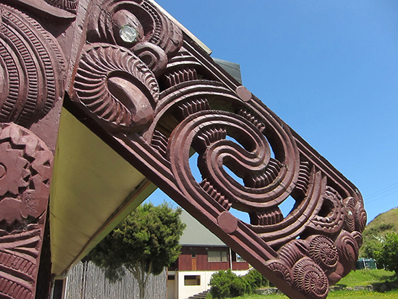
It's a design which could possibly be seen as sitting withing the 'Koru camp.' However the 'Double Rainbow' motif is inspired not so much by the koru, but by a double spiral form taken from whakairo (Wood Carving) which references the connection between (you guessed it) Papatuanuku, Ranginui and Te Ao Marama. Which probably explains my appreciation and support of the Red Peak design.
But I digress. Like many other designs, 'The Double Rainbow' was simply one submission of many, which didn't make it through. I am hopeful that 'The Red Peak' emerges from the pack, much in the way the Canadian Maple Leaf design did in its day, to be a candidate in the final referendum, and with luck, become the design chosen to grace the Waitangi flagpole. It's the one design that has emerged (inadvertently) through the flag submission process which truly captures something of the spirit of our nation, and our people – displaying clear links to the past, while looking forward to the future. Regardless, I'm quietly chuffed that the emergence of the Red Peak itself represents a victory of the spirit over bureaucracy, and an illustration of how the new form of democracy (in the guise of the internet, and social media) can make a significant contribution to a design and selection process.

